Here in this project, we will be discovering new insights on diabetes dataset. We really hope our findings will be helpful. We have diagnostic measurements such as pregnancy, glucose level, blood pressure, skin thickness, insulin, BMI, Diabetes Pedigree Function (DPF) that gives some information on risk level related to hereditary and age. We will be building a model that predicts whether patient has diabetes based on those measurements.
Diabetes occurs when pancreas human organ can’t produce enough insulin in blood. Insulin’s role in a human body is to control glucose levels. Produced insulin acts as a directional tool for glucose and helps to deliver glucose into each human cell. Without insulin, glucose in blood keeps circulating and can’t be delivered to human cells. As a result, glucose level increases in human.
import pandas as pd
from sklearn.preprocessing import MinMaxScaler,StandardScaler
from matplotlib import pyplot as plt
from sklearn.cluster import KMeans
import seaborn as sns
import numpy as np
from sklearn.model_selection import train_test_split
from sklearn.ensemble import RandomForestClassifier
from sklearn.metrics import classification_report,confusion_matrix, roc_auc_score,r2_score
We import all our necessary libraries and data from github Our dataset is located on personal GitHub page that can be imported in our notebook
df = pd.read_csv("https://raw.githubusercontent.com/begen/diabetes/master/diabetes.csv")
df.head()
| Pregnancies | Glucose | BloodPressure | SkinThickness | Insulin | BMI | DiabetesPedigreeFunction | Age | Outcome | |
|---|---|---|---|---|---|---|---|---|---|
| 0 | 6 | 148 | 72 | 35 | 0 | 33.6 | 0.627 | 50 | 1 |
| 1 | 1 | 85 | 66 | 29 | 0 | 26.6 | 0.351 | 31 | 0 |
| 2 | 8 | 183 | 64 | 0 | 0 | 23.3 | 0.672 | 32 | 1 |
| 3 | 1 | 89 | 66 | 23 | 94 | 28.1 | 0.167 | 21 | 0 |
| 4 | 0 | 137 | 40 | 35 | 168 | 43.1 | 2.288 | 33 | 1 |
We can see that the data is small with 768 rows and 9 columns.
df.shape
(768, 9)
We would like to see the correlation between given variables
df.corr()
| Pregnancies | Glucose | BloodPressure | SkinThickness | Insulin | BMI | DiabetesPedigreeFunction | Age | Outcome | |
|---|---|---|---|---|---|---|---|---|---|
| Pregnancies | 1.000000 | 0.129459 | 0.141282 | -0.081672 | -0.073535 | 0.017683 | -0.033523 | 0.544341 | 0.221898 |
| Glucose | 0.129459 | 1.000000 | 0.152590 | 0.057328 | 0.331357 | 0.221071 | 0.137337 | 0.263514 | 0.466581 |
| BloodPressure | 0.141282 | 0.152590 | 1.000000 | 0.207371 | 0.088933 | 0.281805 | 0.041265 | 0.239528 | 0.065068 |
| SkinThickness | -0.081672 | 0.057328 | 0.207371 | 1.000000 | 0.436783 | 0.392573 | 0.183928 | -0.113970 | 0.074752 |
| Insulin | -0.073535 | 0.331357 | 0.088933 | 0.436783 | 1.000000 | 0.197859 | 0.185071 | -0.042163 | 0.130548 |
| BMI | 0.017683 | 0.221071 | 0.281805 | 0.392573 | 0.197859 | 1.000000 | 0.140647 | 0.036242 | 0.292695 |
| DiabetesPedigreeFunction | -0.033523 | 0.137337 | 0.041265 | 0.183928 | 0.185071 | 0.140647 | 1.000000 | 0.033561 | 0.173844 |
| Age | 0.544341 | 0.263514 | 0.239528 | -0.113970 | -0.042163 | 0.036242 | 0.033561 | 1.000000 | 0.238356 |
| Outcome | 0.221898 | 0.466581 | 0.065068 | 0.074752 | 0.130548 | 0.292695 | 0.173844 | 0.238356 | 1.000000 |
In order to visualize out correlation matrix, we will use seaborn’s heatmap.
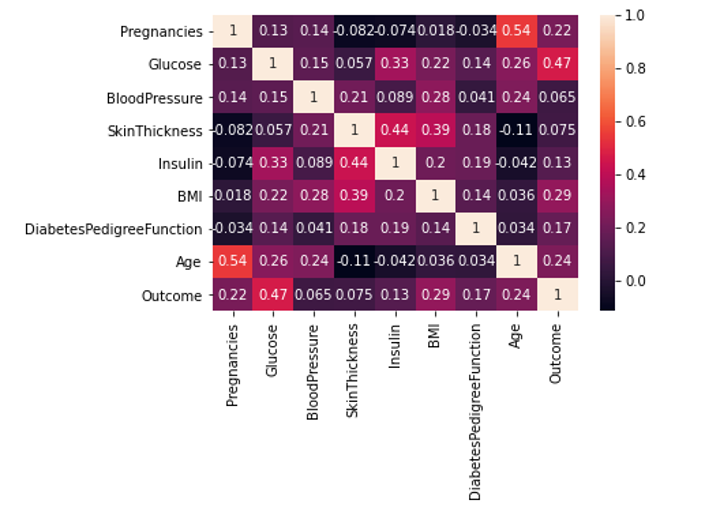 From this correlation heatmap, we can see that BMI with coefficient of 0.29, glucose level of 0.47, age with the coefficient of 0.24 and DPF of 0.17 are all positively correlated with the diabetes diagnosis. It means that people with BMI out of range, people who are older and whose glucose level in blood is higher have higher change of being diagnosed as diabetes. This is mainly related to type 2 diabetes, not type 1.
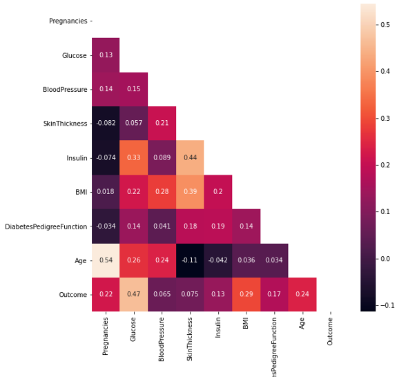
Another correlation visualization is helpful to see correlations between variables with following line of code:
plt.figure(figsize=(9,9))
sns.heatmap(df.corr(), annot=True, mask=np.triu(df.corr()))
plt.ylim(9,0);
Next, we need to check if there are some null values in the dataset. For that, we can run following command:
df.isnull().sum()
Pregnancies                 0
Glucose                     0
BloodPressure               0
SkinThickness               0
Insulin                     0
BMI                         0
DiabetesPedigreeFunction    0
Age                         0
Outcome                     0
dtype: int64
df.describe().transpose()
| count | mean | std | min | 25% | 50% | 75% | max | |
|---|---|---|---|---|---|---|---|---|
| Pregnancies | 768.0 | 3.845052 | 3.369578 | 0.000 | 1.00000 | 3.0000 | 6.00000 | 17.00 |
| Glucose | 768.0 | 120.894531 | 31.972618 | 0.000 | 99.00000 | 117.0000 | 140.25000 | 199.00 |
| BloodPressure | 768.0 | 69.105469 | 19.355807 | 0.000 | 62.00000 | 72.0000 | 80.00000 | 122.00 |
| SkinThickness | 768.0 | 20.536458 | 15.952218 | 0.000 | 0.00000 | 23.0000 | 32.00000 | 99.00 |
| Insulin | 768.0 | 79.799479 | 115.244002 | 0.000 | 0.00000 | 30.5000 | 127.25000 | 846.00 |
| BMI | 768.0 | 31.992578 | 7.884160 | 0.000 | 27.30000 | 32.0000 | 36.60000 | 67.10 |
| DiabetesPedigreeFunction | 768.0 | 0.471876 | 0.331329 | 0.078 | 0.24375 | 0.3725 | 0.62625 | 2.42 |
| Age | 768.0 | 33.240885 | 11.760232 | 21.000 | 24.00000 | 29.0000 | 41.00000 | 81.00 |
| Outcome | 768.0 | 0.348958 | 0.476951 | 0.000 | 0.00000 | 0.0000 | 1.00000 | 1.00 |
Lets see outcome values of diabetes
df['Outcome'].value_counts() # want to see outcome values of diabetes
0    500
1    268
Name: Outcome, dtype: int64
There is 268 people have been diagnosed with diabetes and 500 people not diagnosed.
It would be helpful to allocate BMI with positive outcomes into 6 bins.
plt.figure(figsize=(20,10))
sns.histplot(df[df['Outcome']==1]['BMI'], bins=6);
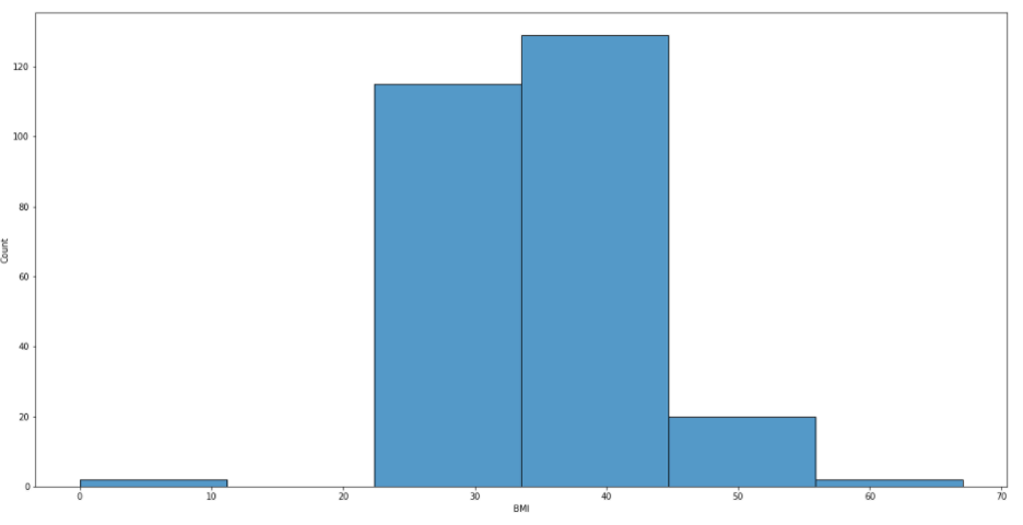
From this picture, we can see that people with BMI between 22 and 56 have been diagnosed with diabetes. If one’s BMI falls within 18.5 to 24.9, it is considered as a normal range.
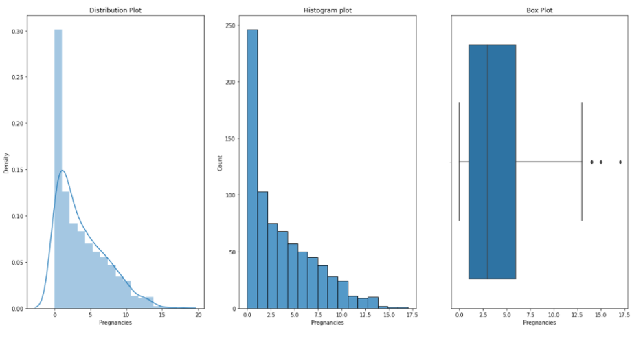
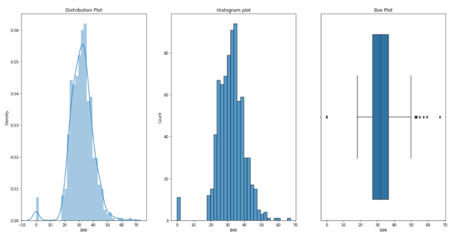
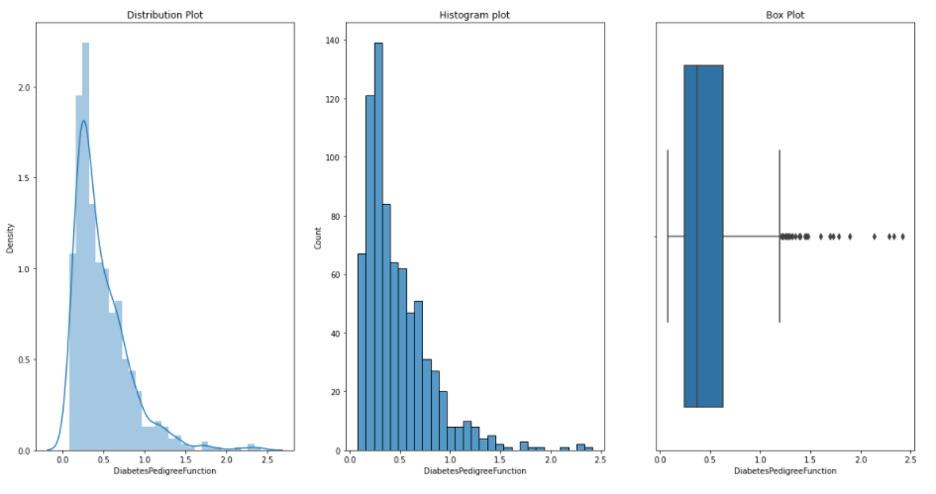
Now, we would like to see distribution, histogram and box plots for each of our variables or measurements. We can do this by running following defined function plotgr:
def plotgr(col):
    for num in col:
        print('Plots : ',num)
        plt.figure(figsize=(20,10))

        #Distribution
        plt.subplot(1,3,1)
        sns.distplot(df[num])
        plt.title('Distribution Plot')

        # Histogram
        plt.subplot(1,3,2)
        sns.histplot(df[num])
        plt.title('Histogram plot')

         # Box plot
        plt.subplot(1,3,3)
        sns.boxplot(df[num])
        plt.title('Box Plot')

        plt.show()
Pregnancies:
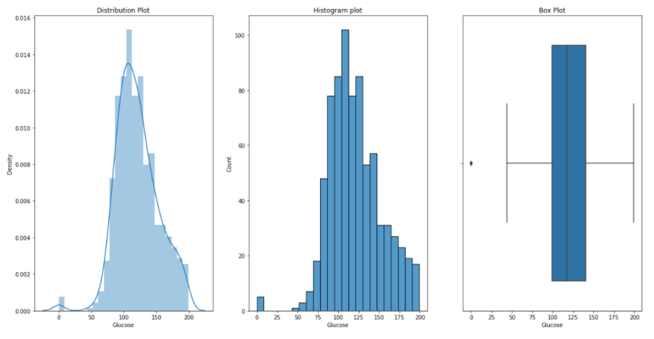
Glucose:
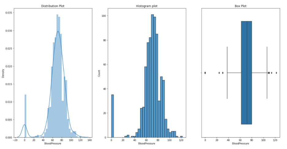
Blood Pressure:
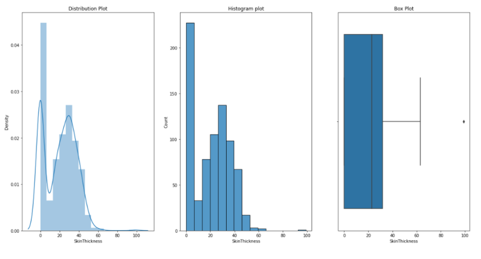
Skin Thikness:
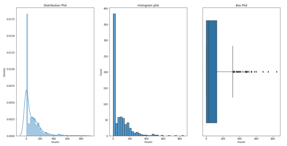
Insulin:
BMI:
DiabetesPedigreeFunction:
Age:

Now lets build our model. First, we split our data into train and test data. We train and test our data in 0.2 and 0.8 ratio, respectively.
y=df['Outcome']
x_train,x_test,y_train,y_test=train_test_split(df,y,test_size=0.2, random_state=15)
scaler=StandardScaler()
x_train=scaler.fit_transform(x_train)
x_test=scaler.transform(x_test)
classifier=RandomForestClassifier()
classifier.fit(x_train,y_train)
y_predicted=classifier.predict(x_test)
r2_score(y_test,y_predicted)
1.0
print(classification_report(y_test,y_predicted))
              precision    recall  f1-score   support

           0       1.00      1.00      1.00       108
           1       1.00      1.00      1.00        46

    accuracy                           1.00       154
   macro avg       1.00      1.00      1.00       154
weighted avg       1.00      1.00      1.00       154
print(confusion_matrix(y_test,y_predicted))
[[108   0]
 [  0  46]]